Monday 9 November 2015

3 Crucial Elements That Affect the Success of Your Website Redesign


One major aim of your website redesign is to improve your interaction with clients and get them interested in as many of your products and services as possible. By paying attention to three elements during the redesign process, you can achieve this goal.

You might think artwork and graphic design is the most important aspect of your website redesign, but it’s more complicated than that. There are three things that you need to “nail”, and if you do, you’ll be on your way to turning your website into a sales engine.

This article will show you which three elements are most important, and how you can implement them in your site.

1.   Customer-Driven Design

The aesthetics, as well as the usability of your site, determine whether visitors choose to stay and browse or leave. To come up with a customer-driven site, you need to:

•        Define who your audience is, understand what they are looking for and state it plainly so they can easily understand it.
•        Come up with a modern, uncluttered user interface that is easy to understand and navigate.
•        Have legible fonts, a color scheme and photography that is relevant and appeals to your audience.
•        Create a consistent layout with the important elements marked and clearly visible.

Pro tip: What you write for your customers on each page of your site is very important. Don’t chase away potential clients. People scan, not read paragraphs. Knowing your customer enough to talk in their language versus in your company-speak will help your message connect.

2.   Relevant Content

For a site redesign to be successful, you need to deliver valuable content to your audience as quickly as possible. Do a content audit on your current site and take stock of what you have and what needs to be added. Then, survey your audience and use web analytics to evaluate which content most visitors are reading, and update that content and use it to get better results.

Pro tip: We’ve written before about providing content that your customer wants and expects — more than just “brochureware” on your people, services, and company-focused information. Content comes in various formats. Don’t be afraid to try more graphical content like infographics or video-based content. Knowing your ideal customer’s habits can clue you in on what types of content they will be willing to consume.

3.   Calls to Action

Your website Design should be aimed at getting your site visitors to perform some kind of action. Thus, it is important that you provide calls to action throughout your website to prompt your visitors to do something specific. Your calls to action should be very obvious and clear, and you can achieve this by:

·         Using colors that contrast the background of the site, so that the call to action buttons stand out.

·         Making call to action graphics large enough to stand out and place them where they are clearly visible.

·         Writing the words in your call to action in a straightforward way, thereby getting visitors to do the specific action you want them to.

·         Keep it simple. Make it an easy process for visitors to carry out the action.

Pro tip: Briefly set an expectation of what people can expect when they click. If the call to action is to download your whitepaper, give them a couple bullets of how the whitepaper will benefit them.


There are many things that you should pay attention to during website redesign, but by ensuring that you have a customer-driven site, great content and plenty of calls to action, you will be able to use your website effectively to generate leads and sales.

Thursday 5 November 2015

16 Actionable Social Media Marketing Facts You Probably Didn’t Know


Being included in social media is awesome fun and very rewarding, and it is one of the most ideal approaches to advertise your business. But sometimes you can feel a little stuck when it comes to new ideas for posts and content on the different platforms.

We assist you with combating this issue with this article, in which we look at 35 different post thoughts for social media. If you do one every day, that’s over a month of great content that should allow you to stand out from the alternate organizations in your industry. Do one of these each other day, and you have got more than two months of your social media marketing content calendar worked out.

So here are the ideas for your social media platforms. Enjoy.

01.A third of Facebook pages post two to four times a week.

Posting frequency on Facebook is a big deal, simply because organic reach is starting to suffer. Some companies combat this by posting more frequently. We found that 3% post up to nine times a day. 31% of companies form the majority here, with posting of two to four times a week being the frequency.

02.Pages that post on Facebook one to four times a week get highest engagement.

Frequency has a lot to answer for. Our research found that those who posted one to four times a week got the highest engagement. The more you post, the smaller the levels of engagement basically, with those that posted 5 to 9 times a day receiving a paltry 5.89% engagement (ouch). However, and if you’re not that busy, those that posted over ten times a day received a slightly healthier 7.66% engagement. Go figure.

03.Native videos are more popular than YouTube on Facebook.

We found that 79.6% of Facebook pages used native Facebook videos, rather than uploading from YouTube or any other social media marketing platform or service. This is a good move as you’ll see in the next fact.

04.Facebook native video does better than YouTube in reach.

The ancient giant that is YouTube is falling behind Facebook in terms of reach when it comes to video uploaded on Facebook. When we looked at reach, Facebook native videos achieve a respectable 13.2% reach of the organic page likes. YouTube videos, when uploaded to Facebook, resulted in 7.9% of organic reach. Instagram, taking up the third position, managed just 6.8% of reach with video.

05.Facebook videos get more engagement too.

Facebook videos simply outperform YouTube videos on Facebook. When it comes to engagement, Facebook native videos achieve 6.3% engagement of the people reached. For YouTube, that figure plummeted down to 3.2%.

06.The majority of pages still don’t post videos on Facebook.

That’s right. The facts above show us that Facebook native video is head and shoulders above any other kind of video uploading on Facebook. The thing is that it is still true that many businesses don’t upload any videos at all on Facebook. In fact, we’re looking at 47% of pages not uploading videos. Does the phrase ‘missing a trick’ sound appropriate right now?

07.Most people watch videos on Facebook for no more than 30 seconds.

53.2% of people watching videos on Facebook stay glued to the screen for no more than 30 seconds. After that, it gets a little stale.

08.Nearly half of the Internet uses Facebook.

Even with all of that slightly worrying stuff above about people not using video, it is still an incredibly exciting social media marketing platform to be on. Currently, 47% of all web users use Facebook. 1.49 billion users log on every month.

09.Majority of the Facebook user base is mobile.

1.31 billion users of Facebook access it with their mobile devices every month.

10.LinkedIn is more popular than you might think.

Every 2 seconds, more than 2 new members join Linkedin. Whoops, there’s another one…

11.Facebook advertising is working. For a ton of companies.

We found that 54.05% of large companies on Facebook (over a million page likes) used Facebook advertising to get reach. The paid reach was 29.94% of their total reach. So advertising not only works on Facebook, the biggest people are using it.

12.Twitter grew. Fast.

It took three years, two months and one day to get to the billionth tweet on Twitter. These days, it just takes a day for 500 million tweets to get sent out. How is your Twitter performance?

13.80% of the Twittersphere is active on mobile.

Similar to Facebook, 80% of all Twitter users access their accounts via their mobile devices.

14.Pinterest has 100 million monthly active users.

Are you on Pinterest? The platform has announced that they have 100 million monthly active users.

15.Average follower growth on Instagram is decreasing.

Instagram is still very much a growing platform, but the average follower growth for profiles in September 2015 was 0.25%. In April it was 1.95%. That’s a serious dip, and may mean that Instagram is becoming ever so slightly saturated.

16.The largest profiles on Instagram are the most active. By far.

The largest profiles on Instagram post, on average, 5.45 posts per day, while the smaller profiles manage just 1.69 posts per day. How can you start expanding your Instagram activities and post more?


So to sum up, the world of social is a fun and large one, not to mention one that is full of facts. Take a look at the 16 (count ‘em) facts above and see how they could inform your next social media campaign.

To know more about Social Media Marketing Visit out website: http://www.creativebrandripples.com

Thursday 29 October 2015

6 Web Design Mistakes That Could Kill Your Conversion


Social Media may be HUGE these days, however nothing beats having a website. Not at all like being fixed to the changing algorithms of Facebook or Twitter, your very own domain gives full control over your business. Furthermore, you can post anything and anytime you need! A customized website also lends your brand authenticity, as a few individuals are still not open to making purchases on social media.

Owning a website is definitely exciting. However, keep in mind that it’s there to serve ONE purpose: to earn you income. Therefore, getting those elusive conversions is key to a successful website. In order to maximize your chances, avoid these top six web design mistakes that could cost you your customers.

Owning a website is definitely exciting. Be that as it may, remember that it's there to serve ONE purpose: to procure you income. In this way, getting those elusive conversion key to a effective website. So as to boost your chances, avoid these top six web design mistakes that could cost you your clients.

#1 Confusing Layout

Today, it's insufficient to offer a wonderful product or service for sale. It's also important to give your objective market a great client experience (CX). This implies making it as simple as could be allowed for them to discover what they're searching for, purchase it safely, and give you feedback if necessary. In short: keep them happy.

Unfortunately, even the most experienced web designing services commit the deadly mistake of crowding a website with all types of content. When people land on your page, they expect to instantly see what they’re looking for. If you’ve made it hard for them, they’ll leave.

Structure your pages by:
·         Outlining your web design and its content (for those who have yet to create a website).
·         Analyzing each web page for structural errors.
·         Removing unnecessary or redundant content.
·         Placing vital content where users can see them immediately (usually above-the-fold).

Study competitor websites to see what they’re doing right. Check if you can implement the same principles on your site.

#2 Unreadable Texts OR Unconvincing Copy

As much as pictures and videos dominate modern content, text or copy still plays a huge role in compelling people to make purchases. Alas, a few websites have the habit of setting up oddly-shaped fonts that are hard to read. While we’re all a fan of beautiful, customized fonts, too much of a good thing is also bad.

Another common mistake is neglecting to utilize duplicate that sells. There are words, and then there are ‘words’. The latter are utilized by marketers, advertisers, and writers to make powerful campaigns. There are just certain words and methods of delivery that engage to the human mind, making things appear to be compelling. Including these in your website will amp up your chances of converting curious consumers.

Power your copy by:

·         Choosing legible font styles.
·         Selecting the best font size for easier readability, especially on mobile.
·         Researching on your target market to incorporate the right words in your campaign.

Never underestimate the power of words; they could either make or break your business.

#3 Poor Navigation

Think of your website as a guided maze.

If you properly implemented the right navigation tactics, your customers should effortlessly find their way towards the action you want them to take (to buy or to subscribe). If you made things confusing, they’ll hastily take the exit route – and probably never come back. While being creative and unconventional makes your site unforgettable, it’s NOT the best strategy to use if you’re a small business that simply wants to sell.

Lead your customers to the right path by:

·         Providing clear call-to-action buttons.
·         Ensuring links are easily seen and lead to the right pages.
·         Checking for errors, missing pages, or misdirects.
·         Not being afraid of white space! This keeps a good balance between space and content within your site.

Being straightforward, both to your audiences and to your goal, should reflect on your site’s design. Speaking of navigation, this brings us to the fourth deadly design sin…

#4 Missing Search Box

Sometimes, your Website Designing Company  visitors would want to search directly for the information they need. They don’t want to use your carefully executed navigational links anymore. Offer them this alternative with a search box. Extend the gesture with advanced filter options for target results. Another benefit to having a search box is quicker answers, especially if you have a large inventory

Websites that fail to include this feature usually turn off customers looking for specific items or info.

#5 Too Many Colors

Picking the right color schemes for your website is like a balancing act: on one hand, you want these shades to make your site visually-appealing; but on the other hand, it’s tough to stick to just one color combination. Remember: colors play a crucial factor in web design. They help highlight links and buttons, support a brand’s overall appeal, and even enhance a customers’ overall web experience.

Follow these golden rules when selecting your website’s official colors:

·         Limit your palette to about 2 to 3 colors only.
·         When in doubt, choose ONE color and then try different shade variations.
·         Colors in your brand logo can also be utilized for added impact.
·         Use free online tools like the Adobe color wheel as your guide.

In general, they should make a statement as well as complement the overall theme of your website.

#6 NOT being mobile.

In this day and age of smart devices, you can’t afford NOT to go mobile. According to Google, 82% of smartphone users turn to their portable gadgets before making a purchasing decision. Their phones have become their shopping assistants. Taking advantage of this opportunity will increase the chances of conversion – simply by being present where your customers are

It’s not enough that your website is mobile-friendly though. Speed is also an issue. Make sure your pages load no more than 3 to 4 seconds, and that you have all important content in place. Do you have a large inventory of products or services? Perhaps you should consider having an app that customers can conveniently download. This strategy would definitely put you one step ahead of your rivals.

Kill Site Issues – Not Conversion!

Regularly performing site checks is a good way of ensuring that everything runs smoothly. Don’t forget to update important content such as your contact information or blog. If you’re still not getting the desired conversion rates, carry out a few tests to see which aspects of your site needs improvement.


Don’t know where to start? Consult a specialist about your problems. The more you delay, the less you earn. So start nipping those web design problems in the bud before it kills your profits! Ask a digital marketing expert today.


Wednesday 28 October 2015

10 Essentials for Every Business Website


1.   Ensure a Responsive Design

Always near the top of Vordik’s list is making sure that a website’s design is entirely responsive. Responsive design means that with the variety of devices currently on the marketplace, your website will need to be able to adapt to screens with a range of width – from a tiny 320 pixels to over 3000. In order to ensure the smoothest experience for your end users, a UX/UI Designer needs to fully understand the implications of user interaction for desktops, tablets, mobiles and more.

2.   Simplify Your Navigation

Especially if you work for a company that is heavy on content and information, it can be very tempting to create an elaborate menu with layers of links and tabs. Website design best practice, however, tells us that having a top-level navigation with a maximum of 5 to 6 links is a much more effective and much less confusing experience for users. When it comes down to it, as daunting as it may seem, taking all of that information and organizing it properly will save time and help speed up conversions in the long run. More often than not, optimized navigation means converting your users in 3 clicks or less.

3.   Don’t forget the Legal

The print may be fine, but the consequences for not having it are definitely not. Not only are Privacy Policy and Terms Of Use sections a legal requirement, but making sure it’s done correctly will keep your company out of trouble and help protect you from threats. Not sure what to include in these sections? The BBB provides a great sample Privacy Policy, while Entrepreneur offers up a guide to terms and conditions. It’s important to remember, however, that a one-size-fits-all approach rarely works, and these templates will need to be looked over carefully and customized to your needs.

4.   Make Sure You Meet Accessibility Requirements for 2016

Did you know that as of January 1, 2016, all websites and web content within Ontario must comply with the Web Content Accessibility Guidelines (WCAG) 2.0 at Level AA? Not only are these standards put in place in an effort to make the web a more accessible space for individuals with disabilities, but failure to meet the standards laid out by AODA and WCAG can result in a $50,000-100,000 fine per day. So, prior to launching, make sure to triple-check that everything is up to code – pun intended.

5.   Optimize Your Speed

In an earlier article, we went in to all of the details about web speed optimization, and what you can do to get things moving if they are running a bit slow. Just to re-iterate the importance of that point, even if you have the nicest designed website in the world and top-notch content, it is proven that the average visitor will leave a website as quickly as 6 seconds if content doesn’t load fast enough. Long gone are the days of dial-up, and today a slow-loading website can truly impact the bottom line.


6.    Fix those broken links

Broken links are one of the biggest online annoyances; so much so, in fact, that many companies have gone out of their way to create cool or funny 404 messages in order to distract annoyed users. However, why don’t we eliminate 404’s altogether? Far beyond annoying users, these links can be detrimental to the all-important SEO score. Luckily, there are many free tools available that can help diagnose a website for links that need fixing. It’s a simple step that can go a long way.

7.   Users should know how to get in touch

While it’s nice to have as much information as possible made readily available on the website, it should never be difficult for the customer to find alternate ways to get in touch with a representative. At Vordik, we usually find it helpful to keep a standard footer with all of the relevant information at the bottom of each web page. Don’t forget that beyond an email address and phone number, users may enjoy a quick contact form and access to any relevant social media account.

8.   URLs should be SEO-friendly

This piece is another quick-fix that is often overlooked. As an important element in the Search Engine Optimization Services algorithm, all website URLs should be kept concise and contain relevant keywords. Whereas in the past it was acceptable to have a URL address such as, a user must now be able to understand exactly what the webpage is about simply by glancing at its URL. The same criterion can be used for Google as well, as the URL is the first indicator of what keywords bots need to be picking up on.

9.   Create a sitemap

A site map is essentially exactly what it sounds like; it is a map that allows both visitors and crawlers to find pages and content on your website Development more easily. This is especially important for large and confusing websites, where pages have complicated relationships, but is considered best practice for any website that has more than 10 pages. Sitemaps come in two formats: XML and HTML, and if you are unsure how to go about creating one, it may be useful to consult Google or enlist a web developer.

10.Flash is dead


Finally, we have absolutely reached the end of Flash days – don’t let anybody tell you differently. While it is safe to say that the web has been headed in this direction for a very long time, Google has recently announced that Chrome will no longer be supporting any websites that utilize flash technology. If you have a Flash website, or have any elements that utilize Flash, it’s best for you to have them recoded in HTML5.

To know more about website design visit: http://www.creativebrandripples.com

Wednesday 21 October 2015

Machine learning enters the SEO world

robot keyboard


For years, the search engine optimization industry has been dominated by Google’s algorithm update. Each time marketers would hear a term like Panda, Pigeon or “Mobilegeddon“, they knew exactly what it meant: a thorough audit of their current website along with a number of improvements necessary to prevent a precarious drop in ranking.
But increasingly, a sentiment is starting to grow that we’re entering a brave new world in SEO, one that may lead to search engine optimization in which the modus operandi looks nothing like it has before. Machine learning has entered the field, and it comes with the potential to overhaul everything we know about the importance of algorithm updates to SEO.
Machine Learning? As in, Robots Who Are Taking Over?
Well, yes and no. Machine learning, as you might be able to infer from the term, refers to the science of getting computers to act without being explicitly programmed.
No, Google’s SEO algorithm will not soon rule our world and become a machine overlord (although considering how much we as a society rely on search engines, you could argue that’s already happening). But for Google, machine learning would mean an algorithm that does not need to be updated manually in order to adjust and keep showing the most relevant results possible.
We’re not there yet. As of today, Google still relies on manual updates (the latest being an update to its Panda algorithm) to ensure relevance and avoid fraudulence in its search results. And while Google likes to infer that its algorithm is already unbeatable, there are numerous examples of old, seemingly defunct methods of SEO still working.
In fact, the company still requires an army of human quality assurance workersto make sure it’s working the way it should be working.
But we now know that the search engine giant is officially researching machine learning possibilities. And taking the human element out of the equation could have wide-reaching consequences for digital marketers everywhere.
How Machine Learning Will Impact SEO
Above all, a search algorithm that learns and updates itself automatically would mean fewer updates that throw the digital marketing world into turmoil.
Just imagine what would have happened if Google’s “Mobilegeddon” update earlier this year, which had marketers everywhere panicking and making sure their websites were compliant with Google’s mobile-friendliness standards, had happened without a prior or point-in-time announcement of intent by the search engine.
On April 21, 2015, marketers would still have seen websites that weren’t responsive or mobile friendly ranked lower on mobile searches. And over time, we’re confident that they would have adjusted to the same degree as they did with the announcement. But the panic we witnessed before, during, and shortly after that date would simply have been non-existent.
At the same time, in a machine learning environment, Google engineers themselves would not be the authority figures they are today. While noted insiders like John Mueller would clearly remain authority figures, they might not be able to gain traction as easily with specific warnings about practices like link building.

To Read More about Preparing for Machine Learning Possibilities visit:
http://venturebeat.com/2015/10/18/machine-learning-enters-the-seo-world/


Thursday 8 October 2015

Is Web design becoming irrelevant?

The heart and soul of design is making the user happy.  
In order to satisfy users, you must design beyond the page. You need to understand the entire journey, especially how people use your website as part of a multi-device experience.
So is Web design becoming irrelevant? Or does it require us to redefine the skill set of the Web designer?
In this piece, we’ll talk about why (and how) to think beyond Web design.

The Democratization of Web UI Design

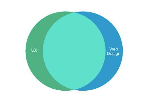
When it comes to Web design, it’s easy to focus purely on the UI.
After all, that’s what clients and stakeholders can see and touch, so that’s where you’ll probably hear the most feedback. UX design, on the other hard, is more difficult. It’s hard to know precisely what will make the user happy, especially when you can just rearrange the layout and call it “improved.”
Screen Shot 2015-10-08 at 12.20.34
UX design for the Web is not a new concept. But as explained in UX Design Trends 2015 & 2016, recent advancements in self-serve Web design have made UX design a true competitive advantage for designers. Certain services and algorithms might help us design visually beautiful websites, but they can’t help us design a great Web experience (not yet, at least).
In his controversial piece Why Web Design is Dead, Sergio Nouvel explains why the old ways of Web design are on their way out. While his piece takes a more extreme view of Web design, we certainly agree with his reasoning for why Web designers must evolve, and his problems seem solvable through emphasizing UX principles.
To Read More about Web design becoming irrelevant? :
http://thenextweb.com/dd/2015/10/08/is-web-design-becoming-irrelevant/
www.creativebrandripples.com


Saturday 12 September 2015

Responsive Web design makes an inefficient design too darn easy

final cbr logo
Responsive Web design makes scaling a website up and down for a mobile device easy. Almost as easy as it facilitates sloppy designs that don't even try to intelligently choose what stays, what goes and, most critically, what should stand by until it's needed.

Fast response, almost-instant home pages and effortless scrolling are always Web design goals, but with the increasingly plummeting attention spans of mobile users, this is crucial. Nowhere is it more crucial than retail mobile sites and/or apps, where purchasing a plasma screen TV with free shipping waits for no man.

Here's where things get tricky. A proper design is intelligent, where image size/resolution/retention choices are not things that can be delegated to a script. Is that image decorative — an attractive model, a splash of vibrant color — or is it an essential depiction of the product, something that could make or break a sale?

The problem with responsive design is that it makes it far too easy to sit back and let the algorithms make the decisions. To be fair, the resultant pages generally look fine. But what they almost never are is as efficient as possible, since that requires human judgment.

I had an interesting discussion about this on Thursday (Sept. 10) with Ari Weil, the marketing vice president for a cloud vendor called Yottaa. Yes, Weil's company sells personalized designs — where the company's staff offers those human decisions — but his argument still works, severe business biases notwithstanding. He argued that responsive Web design was originally intended as a temporary Band-Aid for desktop scaling and it was forced into double duty working with phones (which were never initially designed to display data) where it "tries to force efficiencies on those devices. The result? Pages that are bloated, slow and scale poorly."

The problem in detecting these responsive site shortfalls is reminiscent of the problem of overloaded and slow e-commerce sites. All the e-commerce director sees are the large number of sales that are recorded. If they're 70% more than yesterday, everything seems great. What's missing? That e-commerce director has no clue how many customers are being turned away and, therefore, how much better than 70% the figure would have been had the site been up more.

With responsive design, there is a similar blind spot. The site/Web page looks good. But there's no way for the e-commerce team to know how many customers left because of slow response. They'll never know how many dollars would have otherwise been spent with them.

Up to now in this column, I've taken the shorthand site/app to refer to both, but there's a reason to split the two. Done properly, an app should deliver far better initial performance than a site, if for no other reason than the browser's initial download is eliminated and everything is focused on that retailer's single message.

Still, companies are focusing less on apps and more on Mobile Website Design Mumbai sites. Weil said the reason is the fear that shoppers may not want to download an app for a merchant they don't intend to use that often. Although that's true, the reason for app resistance is much deeper.

First, it's not that unusual for friends, family and romantic partners (potential as well as actual) to see the home screen/screens of someone's mobile device. That means that the apps they choose will signal how they want to be perceived. That gives a big edge to impressive sites — an atlas, Barron's, the Society for the Betterment of Babies and Small Animals — that will never be opened. The same goes for favorite sites that one may not be proud of visiting (yeah, readers, no examples are needed here).

Second, and much more fundamentally, both Apple's iOS and Google's Android mobile OSes are dreadful at displaying a lot of apps. It's not uncommon for power users to have 40 or more (sometimes far more) apps on their phones. When that happens, it can literally take more time to find the app than to launch a browser and type in the URL.

A confession, from someone who has a lot of apps on his iPhone: When no one is around, I have found myself asking Siri to find my app by saying "Siri, open GoogleMaps." Yes, I take inordinate pleasure in asking Siri to open Google apps. But having fun taunting Siri aside, it's the fastest way to open the app. And that's pretty sad.

Both iOS and Android "make it a chore to have too many apps," Weil said. "People continue to show us through their behavior that they like the actual Web and prefer it to apps." If mobile GUIs were better at handling lots of app icons, I doubt that would be true.
Those mobile OSes were designed to make things easy, not efficient. Sound familiar?

You want to create Responsive Web design Mumbai for your Business visit: http://www.creativebrandripples.com